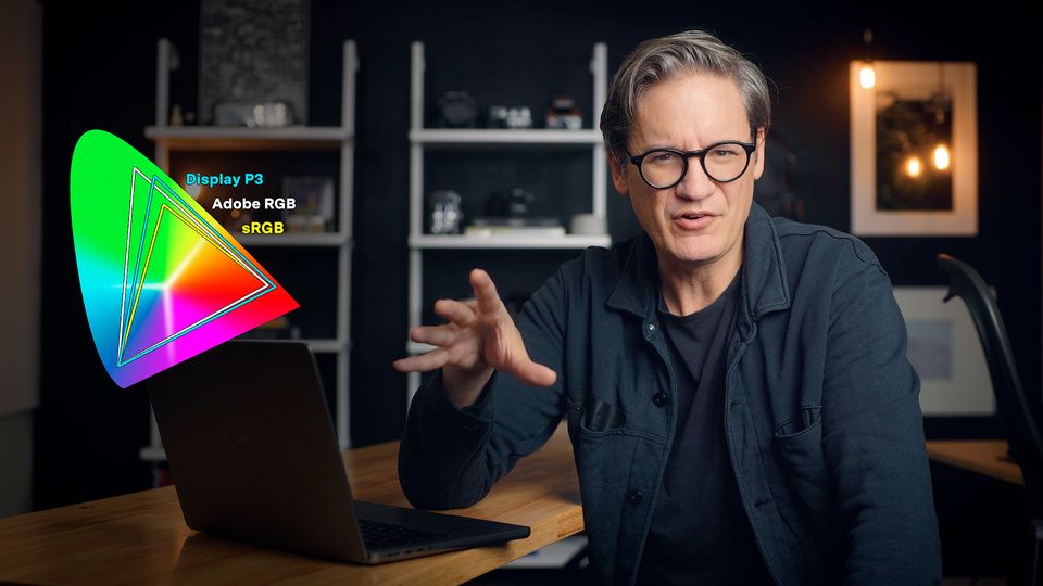
What is Adobe RGB, and does it matter when buying a display?
Desktop monitors today typically use either sRGB or P3 (aka "Display P3") as their color gamut. sRGB is smaller and supports fewer colors (16.7 million), while P3 is larger and supports more colors (over 1 billion). P3 has taken off over the past decade, with widespread adoption in smartphones, tablets, laptops, all-in-one computers, and desktop displays, and will likely supplant sRGB as the standard color space for the web (which remains stubbornly committed to sRGB).
But there's a third color space you see in displays marketed to designers and photographers: Adobe RGB.
What is Adobe RGB? How does it compare to P3? And does it matter?
Origins of Adobe RGB
Back in the 90s when the desktop computing and the world wide web were just getting off the ground, Microsoft and display hardware manufacturers decided that a standardized color space was needed to create a more consistent user experience across the myriad of PCs being manufactured. The result was sRGB, a color space modeled on Rec.709 (the standard color space of HD broadcast video), but with a brighter gamma value of 2.2 instead of 2.4 because computer displays were viewed mostly in offices, not dark living rooms.
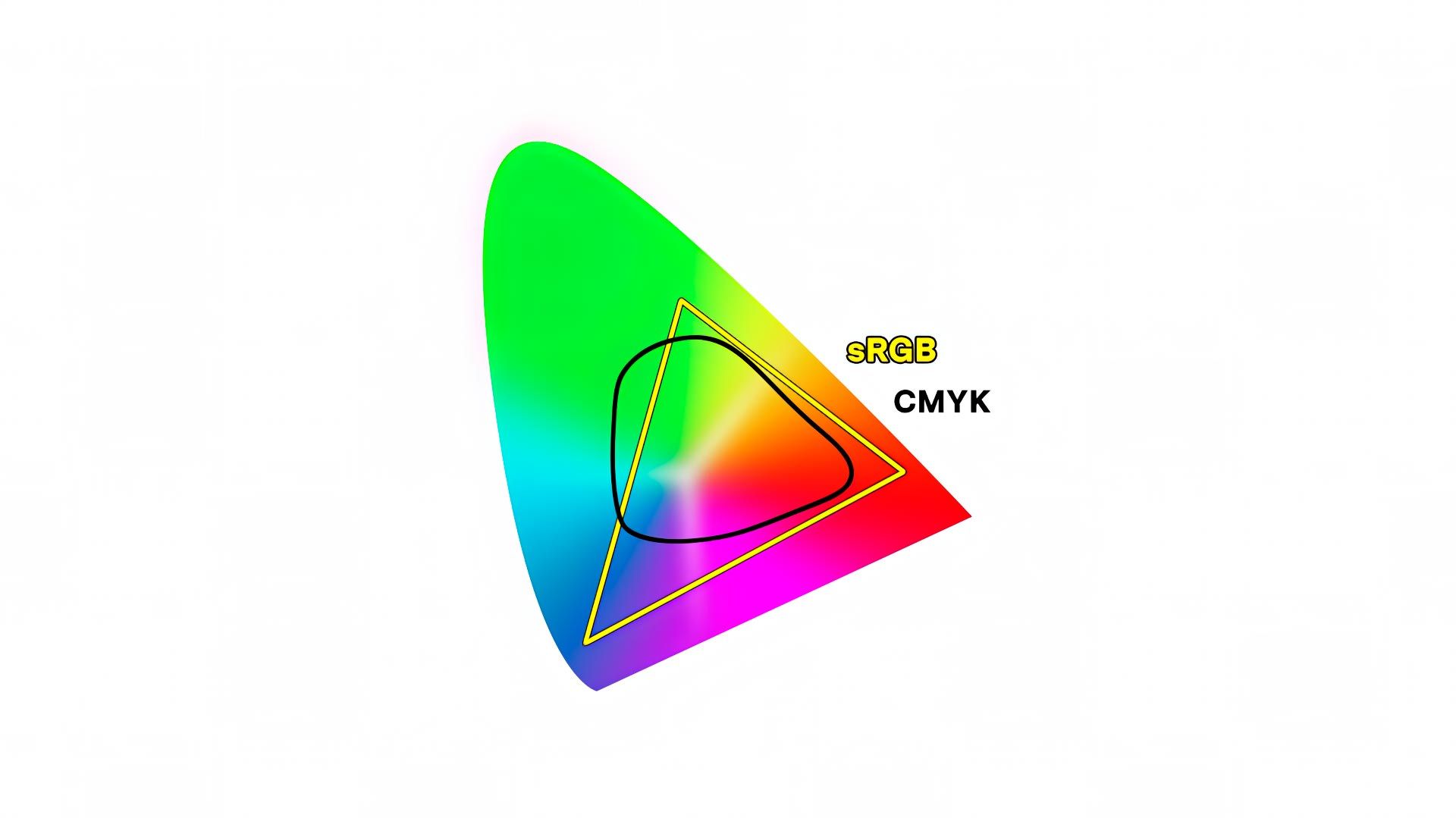
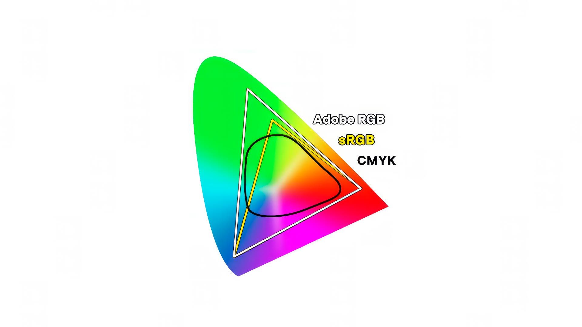
Everyone benefited from a consistent color standard, but problems emerged in the design and print industry. The sRGB color gamut was smaller than the full range of hues supported by four color, CMYK printing (as illustrated below). This meant that a designer or photographer couldn't see on screen all the colors their printers and papers were capable of printing.
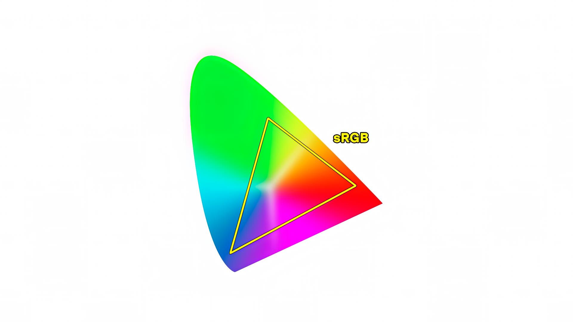
This is why, in 1998, Adobe stepped in an made their own color gamut: Adobe RGB. Adobe RGB was 35% larger than sRGB, and purposely sized to include nearly all the same hues supported by most CMYK printers and papers. Not 100% coverage, but definitely more/better coverage than the limited color range of sRGB.
Unfortunately, Adobe RGB never caught on outside the design and print world. PC manufacturers (and Apple) stuck with sRGB, for they most likely didn't see the benefit of offering Adobe RGB to the general public. For years thereafter, sRGB was the dominant color space used everywhere and by everyone, while Adobe RGB was a relegated to niche status in photography and design circles.
The new kid on the block: P3
In 2005, DCI-P3 was created by the Digital Cinema Initiative as a new standard for digital motion pictures. The color space was larger than sRGB, and contained more or less the same range of hues supported by Adobe RGB. Ten years later, Apple repeated history by copying a video color gamut (this time, DCI-P3) to create "Display P3" for their 2015 iMac, followed by the iPhone 7 in 2016, then all other Apple devices and products thereafter. Samsung, Google and PC manufacturers also got on board and started offering their own "wide gamut" displays, all adopting the new P3 color gamut.
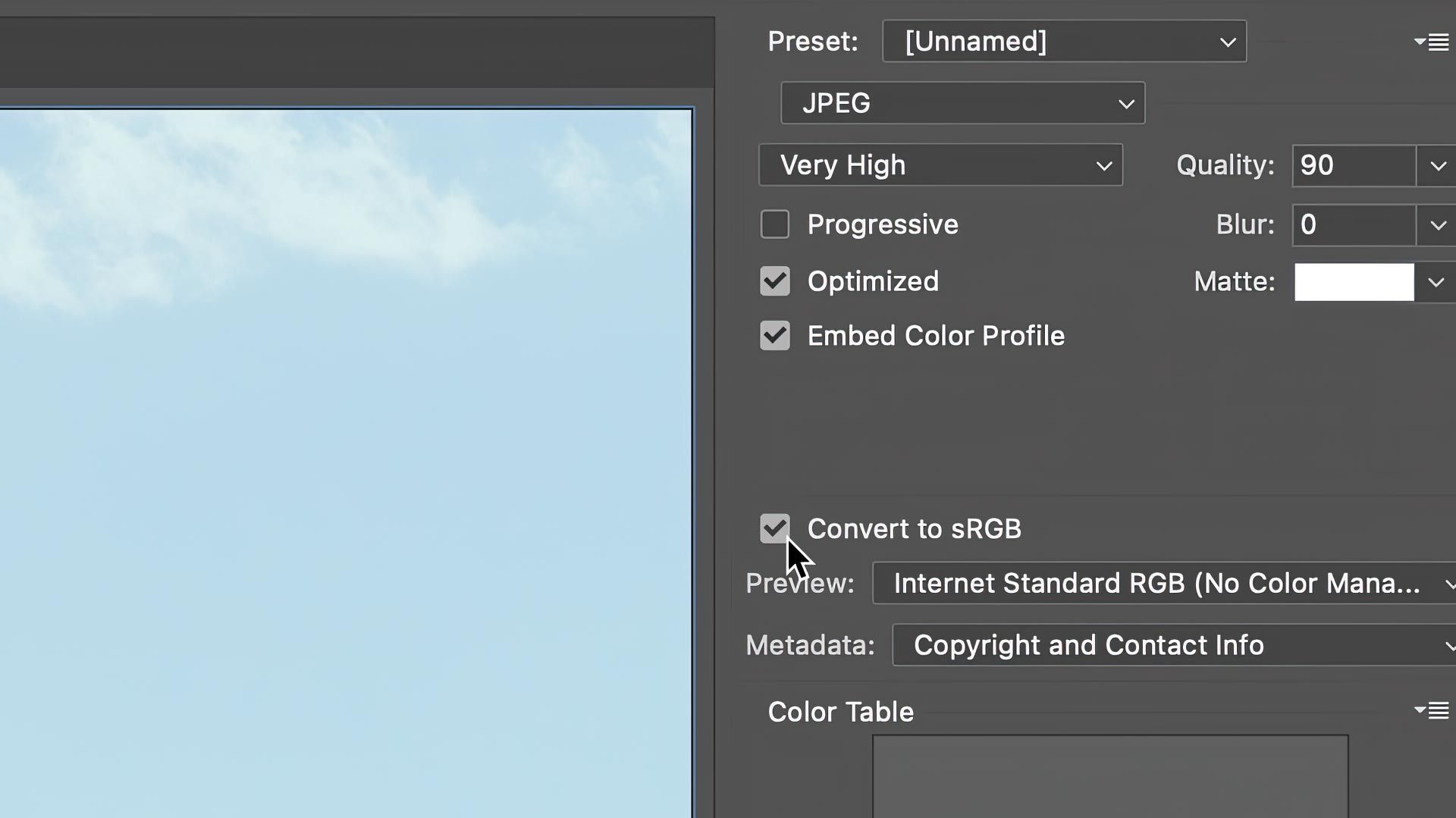
P3 is now the dominant hardware color space, but the internet has been slow to catch up. Web browsers are incrementally adding support for P3, but websites and social media networks are largely stuck in the past. Upload a photo anywhere on the web, and odds are it will be converted to sRGB. This is why all photographers still have to check the "Convert to sRGB" box when saving for the web from Photoshop and other image editors.
Perhaps at some point this will change and photographers will finally be able to display their images online with the same range of hues their wide gamut desktop displays are capable of, but for now sRGB stubbornly hangs on.
P3 was a definite improvement for the average user compared to sRGB, but as they say, those who forget history are doomed to repeat it. P3 again blindly copied a color space used for video and film (like sRGB did with Rec.709), but didn't consider the needs of CMYK printing. P3 should have been the death knell for Adobe RGB, but wasn't.
Comparing P3 to Adobe RGB
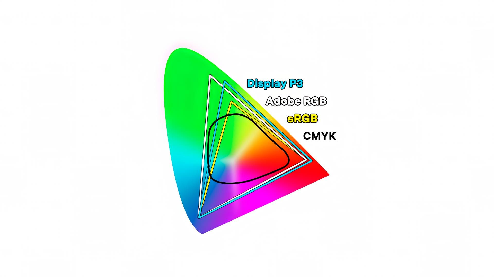
P3 and Adobe RGB are both approximately 35% larger than sRGB, and cover more or less the same range of hues (just over 1 billion), but their shapes are slightly different. Adobe RGB extends more into richly saturated blues and greens, while P3 extends more into richly saturated oranges and reds. Mathematically speaking, P3 is actually smaller than Adobe RGB, with 45% coverage of the CIE chromaticity diagram, while Adobe RGB covers 52%.
The result? Adobe RGB supports a broader range of hues than sRGB and Display P3. Not a huge difference, but a difference nonetheless.
What this means is that a display supporting Adobe RGB can display the broadest range of hues available, and does a better job of covering CMYK than any other color gamut, including P3.
But from a practical perspective, does Adobe RGB's larger color gamut matter? Well, it depends on the type of images you create, and whether you make prints of your photography.
For example, if you photograph seascapes, blue skies, and/or forests with lush green leaves and trees, Adobe RGB will do a better job of visualizing those richly saturated colors. If your photograph does not contain rich blues or greens, it doesn't matter whether your display is using Adobe RGB or P3.
This is why many people have no trouble editing photos on a P3 display, for the P3 color gamut covers almost all the same hues as Adobe RGB. The same practical range of hues.
But the simple fact remains that Adobe RGB covers the broadest range of hues, and is a standard the printing industry has been handling for nearly three decades. For example, when I upload an image to Whitewall to make a print, I edit and save the image in Adobe RGB, then let them handle any necessary conversion to make a print (which can be different depending on the type of print being made).
What about consumer inkjet photo printers?
Thus far I've mostly talked about commercial CMYK printers, but what about consumer inkjet photo printers? Is Adobe RGB better for that as well?
Inkjet photo printers (like my Canon Pro-300) use cyan, magenta, yellow and black like a commercial printer, but also mix in additional colors like "Photo Cyan", Red, Gray, Matte Black, and more to create richer, more accurate colors on paper. But unlike a commercial printer, you don't need to convert images to CMYK prior to printing. Inkjet photo printers are designed for RGB images, and translate colors from RGB to the myriad of ink colors they support.
Compared to P3, Adobe RGB does a slightly better job of displaying the full range of hues my printer and choice of paper can support. We can quantify this by comparing the ICC profiles for Adobe RGB and P3 against the ICC profile for my printer and paper using the Color Profile utility bundled in macOS.
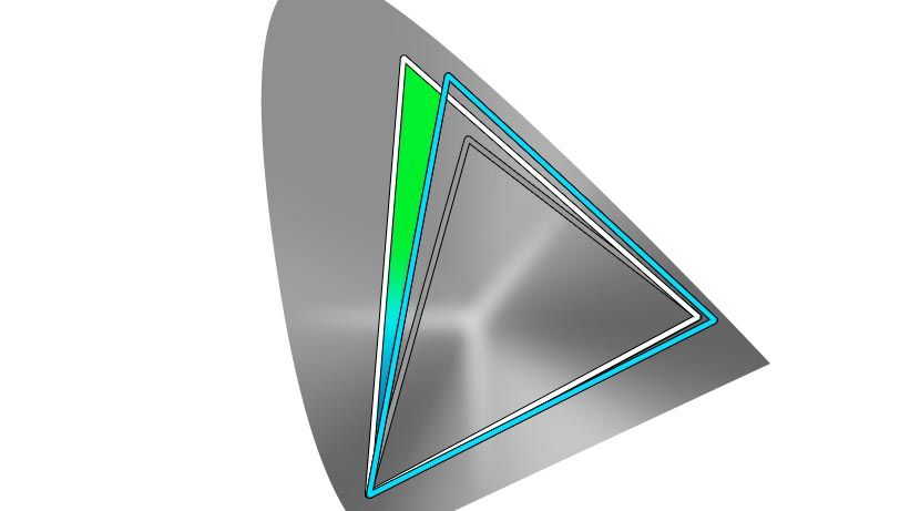
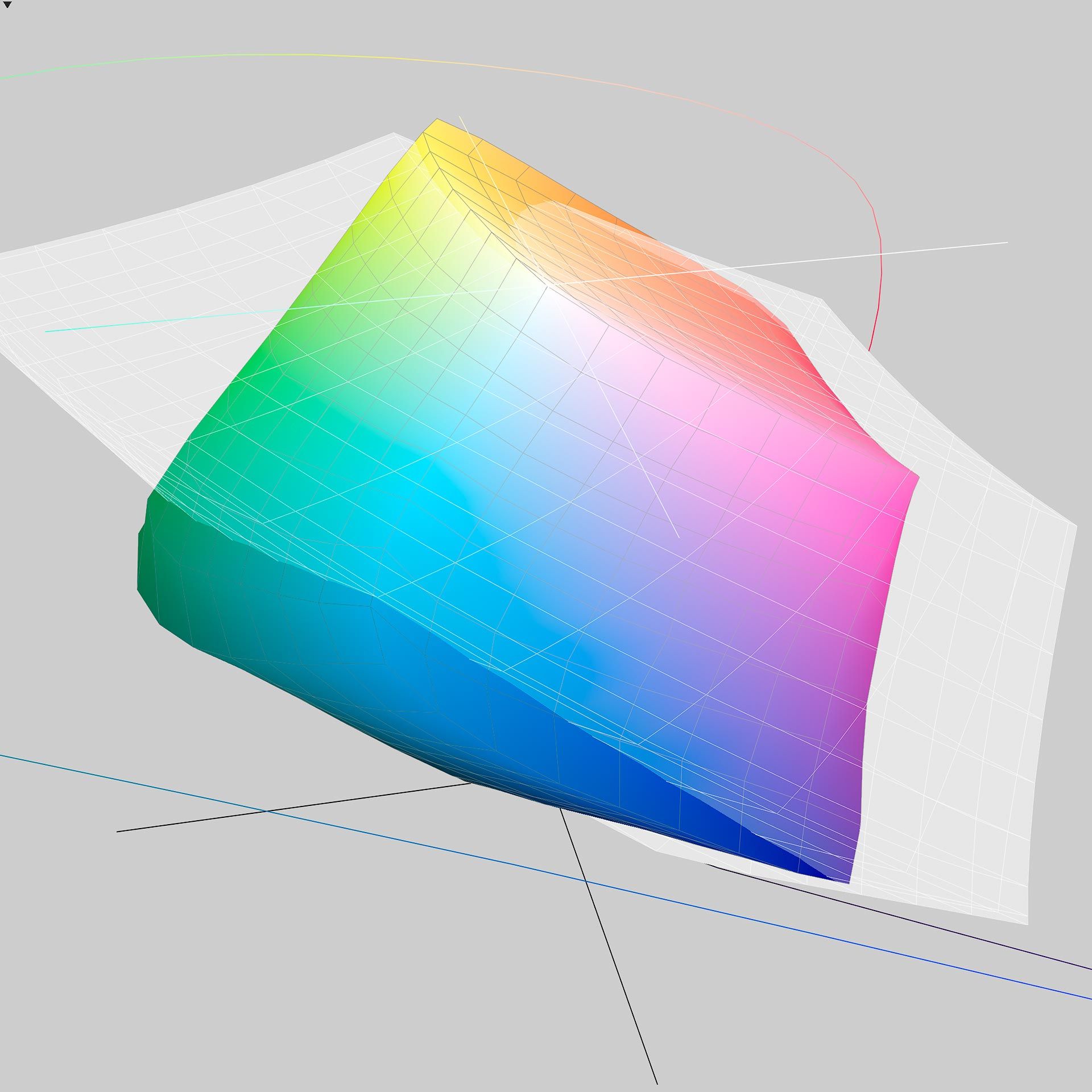
Here is how the color gamut of Hahnemuhle Photo Rag Baryta (which is an excellent paper, by the way) printed using a Canon Pro-300 compares to Adobe RGB. The color spectrum shown below is the range of hues supported by the paper and my Canon Pro-300 inkjet printer, while the semi-opaque light gray shape is the Adobe RGB color gamut.
And here is the same paper compared to Display P3. Again, the semi-opaque light gray shape is the Display P3 color gamut, and the spectrum is the paper/printer.
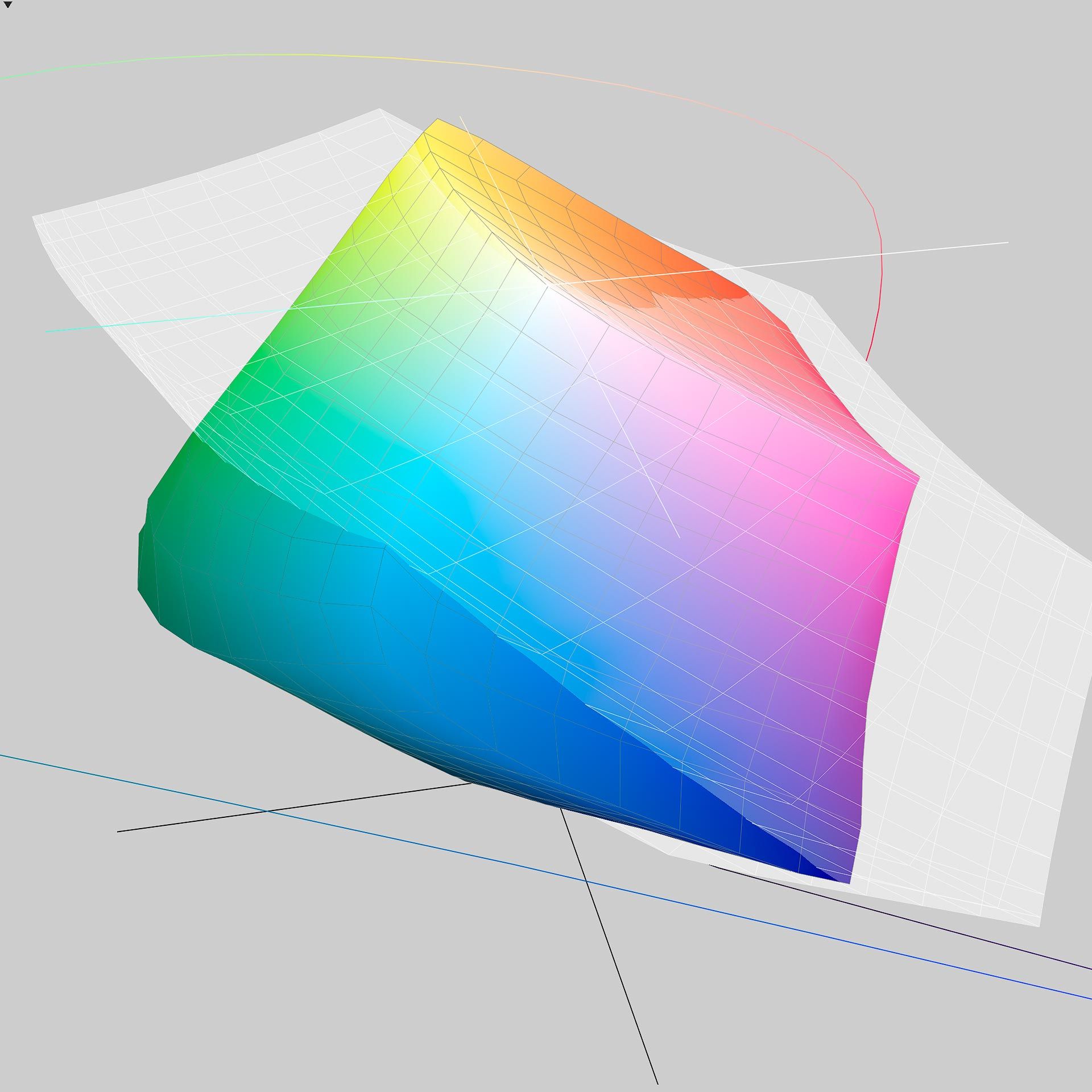
See the difference? More of the rich blues and greens supported by this paper and printer combination are within the boundaries of Adobe RGB, which means they are "in-gamut". Display P3 is similar, but doesn't extend quite as far as Adobe RGB, making some of the rich blues and greens "out of gamut" when viewed using a Display P3 monitor.
Summary
Overall, Adobe RGB is a better color gamut for editing photos because it covers more hues than any other color gamut, including P3. This is why display manufacturers (like BenQ, Eizo and others) continue to support Adobe RGB, and the whole world hasn't moved to P3. Had P3 been designed with a slightly larger gamut, Adobe RGB would today be mostly irrelevant. But that's not how history turned out.
If purchasing a desktop monitor for photo editing, either Adobe RGB or P3 will be better than sRGB, no question about it. Either color gamut will do a better job displaying your images on screen (and when printed) compared to comparatively cheaper, outdated sRGB monitors. If I were choosing between Adobe RGB and P3 for a photo editing display, I'd choose Adobe RGB first, P3 second.