Practical tips for creating black and white photos from color
Unless you can afford one of these, most photographers create black and white photographs using color, digital raw files. This is more than simply desaturating a photo or converting it to Grayscale in Photoshop. Converting color to black and white is a process unto itself, with its own workflow and creative considerations. I don't consider myself an expert at this by any means, but have learned a few things along the way that may prove helpful to others doing the same.
Preview black and white more easily
The quickest and simplest way to gut check how color images will appear when converted to black and white is to switch your display to monochrome. This will remove all color from the user interface, but is so much faster than creating an actual black and white image.
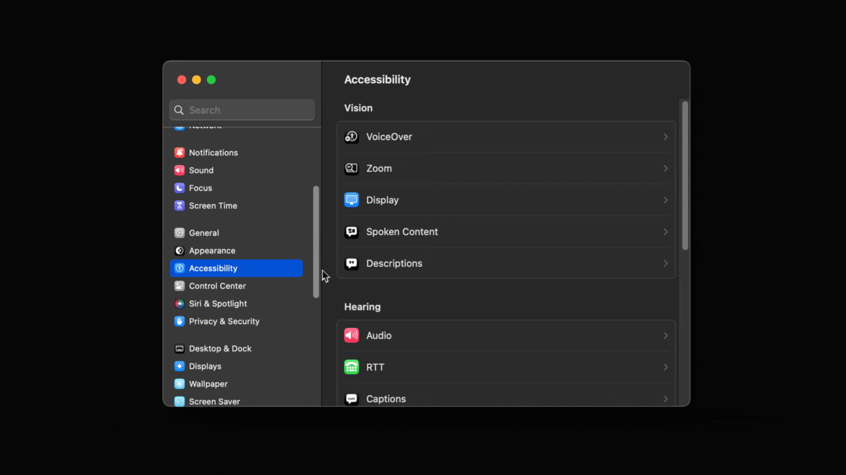
If using macOS, simply go to the Accessibility settings in System Preferences, click on Display, then scroll down until you see Color Filters. Set "Grayscale" as the Filter type if not already selected, then enable. Everything on screen will then be monochrome. (I'm not a Windows user, but I'm sure this can be done just as easily using that operating system).
Another option is buying a display that has a monochrome mode. For example, my BenQ SW271C has a "B+W" mode that effectively does the same thing as the Grayscale operating system filter, but can be triggered on/off through a button using BenQ's desktop puck interface.
Not all color images work in black and white
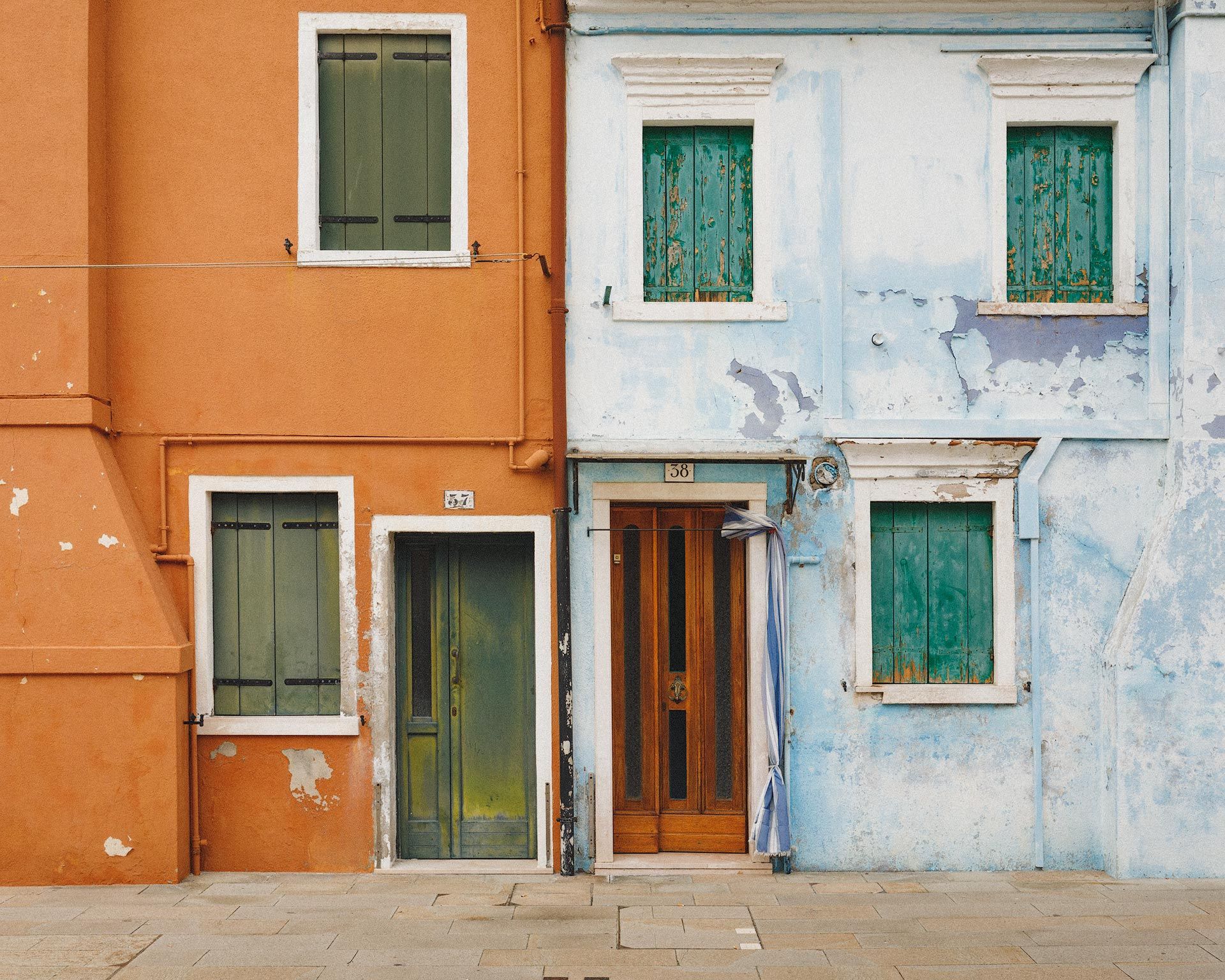
Removing color can often make an image worse, not better. This is especially true when color provides contrast, context, and visual interest. For example, in the image below, the complementary orange and blue color schemes of the buildings are not just pleasing to look at, but make the image more interesting because of their unusual hues, and how they visually separate the left building from the right. The green shutters and orange-hued door on the blue house are also interesting visual overlaps.
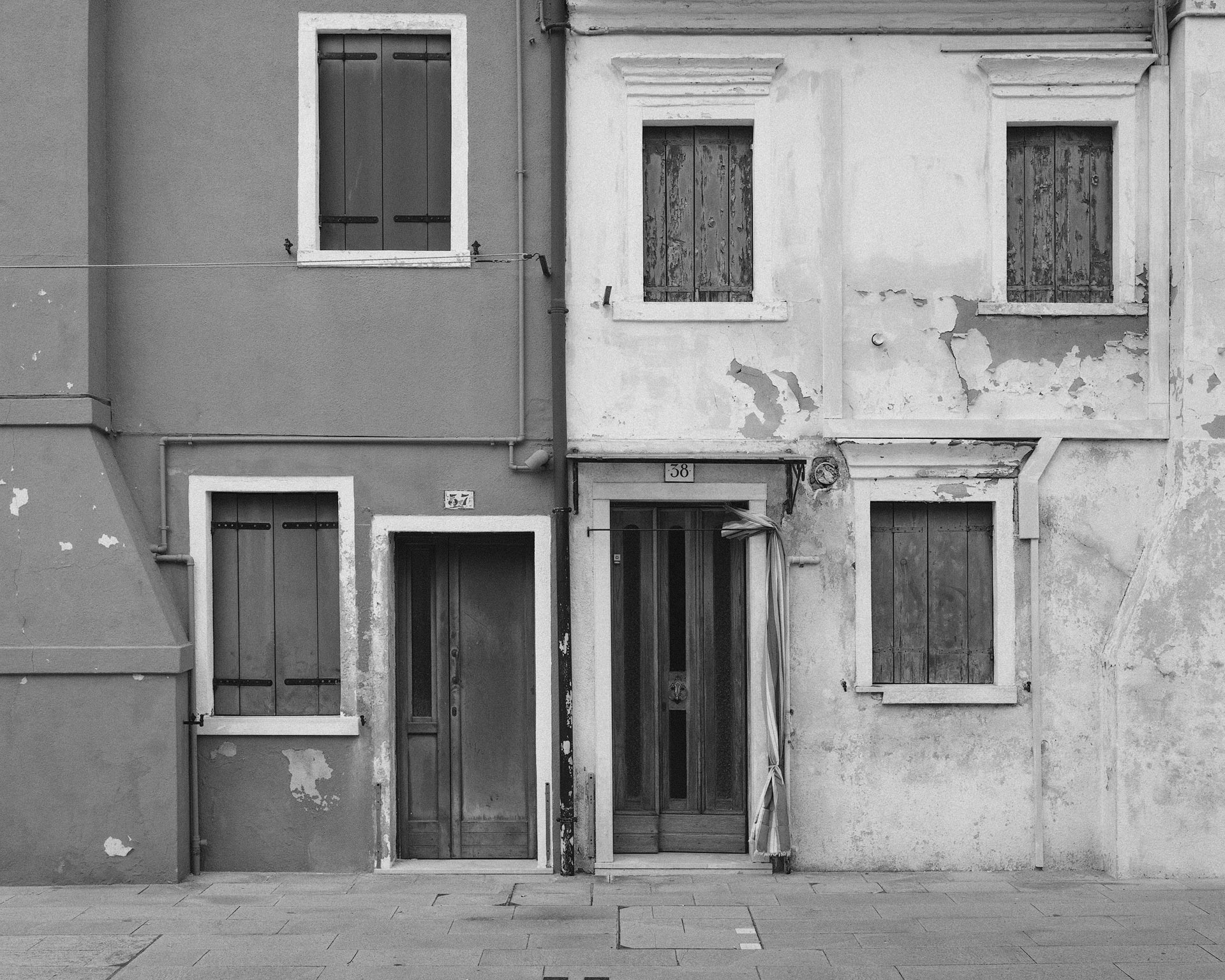
When converted to black and white however (pictured below), everything that is interesting about the color image is lost. The buildings now look light gray and dark gray, with nearly identical brightness values for their shutters and doors. Notice too how the sidewalk blends visually into the buildings. Additional separation could be created with localized dodging and burning, but in this instance, nothing I could add to the black and white image would make it better than the original color version.
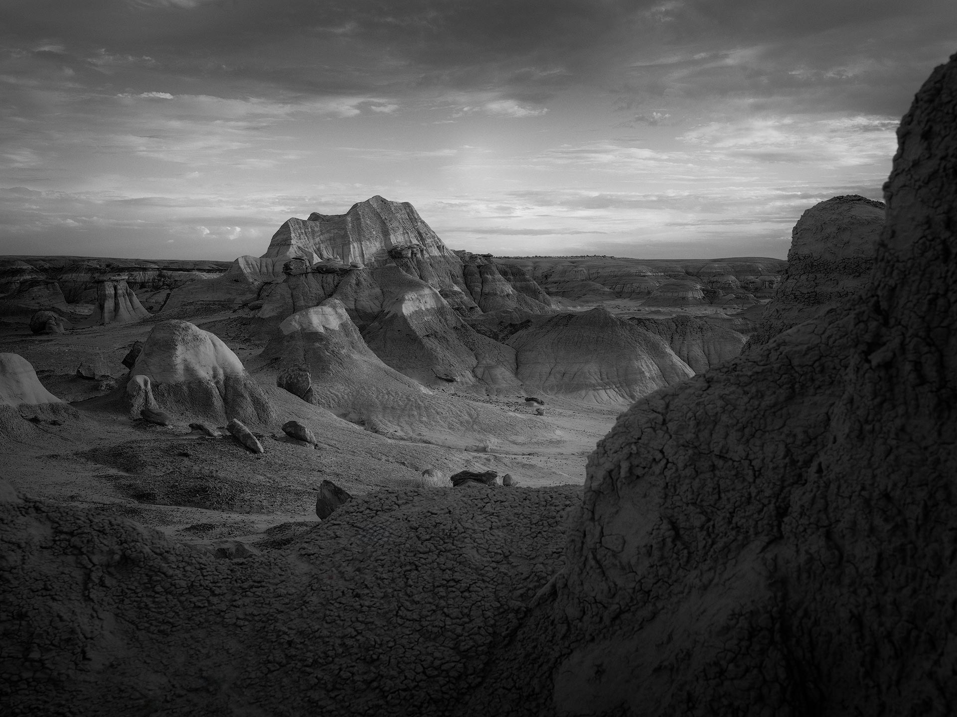
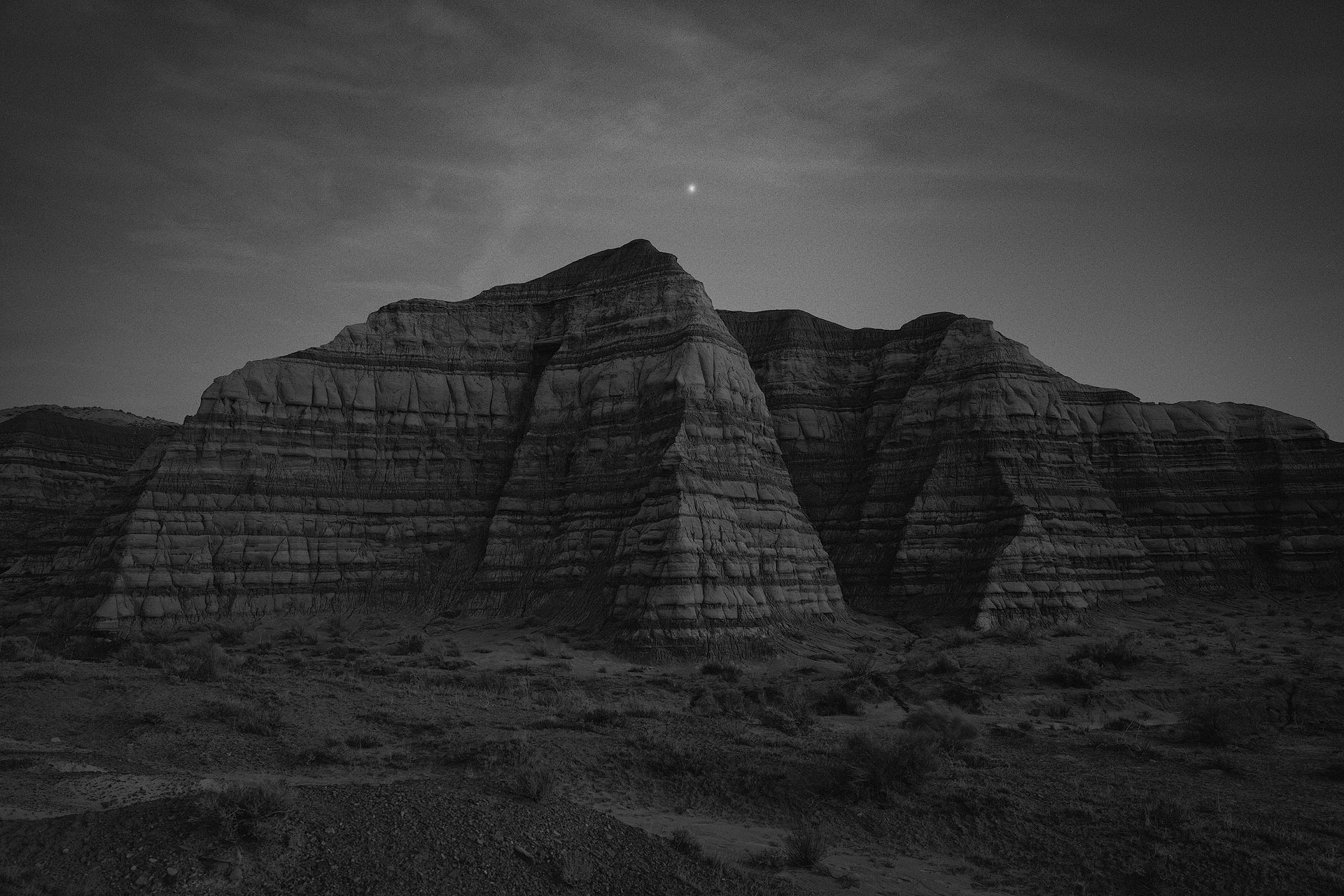
On the other hand, there are some images where color diminishes quality. Colors that do not tell a story, add visual interest, or are aesthetically pleasing to the eye. For example, in the landscape image below (which is a straight out of camera raw file), there's a weird mix of cyan and magenta hues in the midtones and highlights, plus rock formations that have a weird greenish-brown tint.
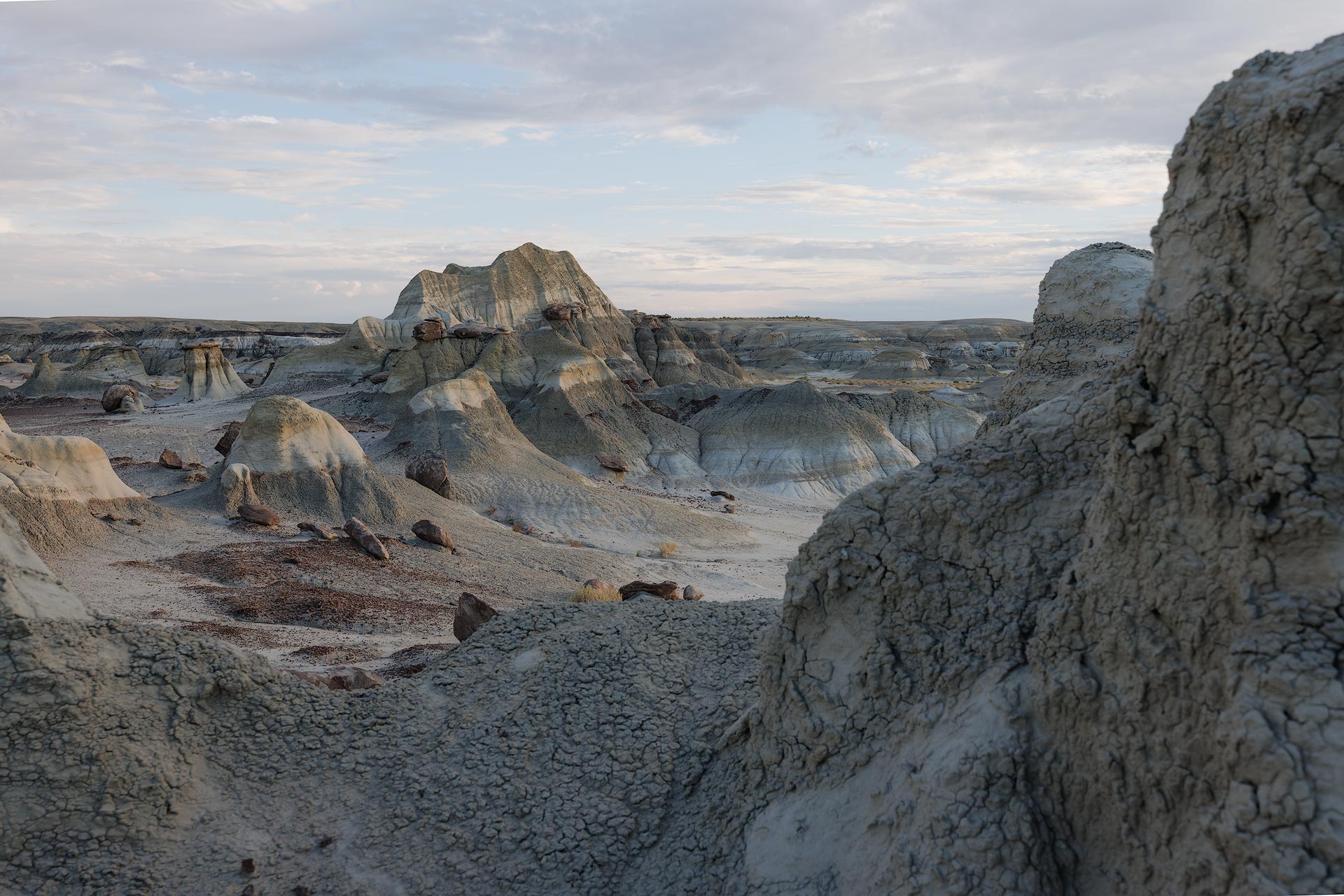
Granted, I could adjust hue, saturation and luminance to try and rectify these issues (trust me, I have), but a better solution is to simply get rid of all offending colors. Converted to black and white, the textures, shapes, and contours of the landscape are now more noticeable. The image is simpler, stronger and more dramatic.
Midday sun? No problem
You will often hear landscape and outdoor photographers say the best time of day to shoot is when the sun is sitting low in the sky, just above or below the horizon. This helps create soft, low contrast images that fit more easily within the dynamic range of a digital camera, and usually provides better color as well. There's nothing technically wrong with that advice, but in my experience it is mostly applicable to color photography, not black and white.
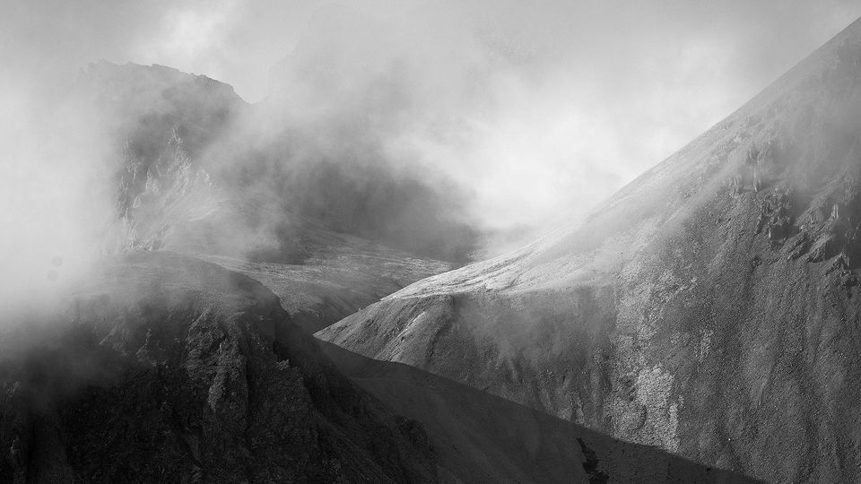
Truth is, great photographs can be created anytime of day, even in harsh light. This is especially true for black and white, which thrives on the interplay of bright whites and dark shadows. The lack of color saturation and vibrancy typically seen at midday also doesn't matter, for black and white removes color and reveals a subject's underlying texture and detail.
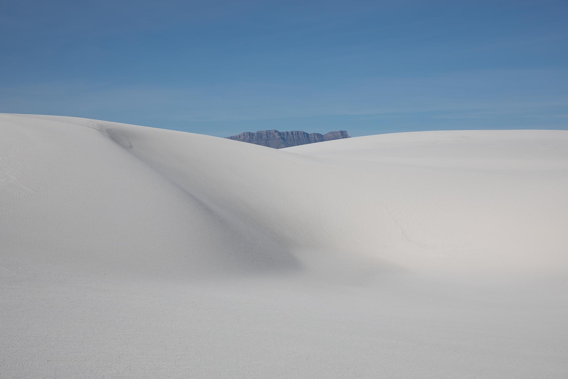
For example, I captured the following image midday as part of a "scouting" effort to find suitable subjects and compositions for shooting at sunrise or sunset. I exposed for the highlights (the sand) to ensure I wouldn't blow out my highlights. The mountains in the background are hazy, and the image colors aren't particularly great either. Also, in continuation of my earlier point, color isn't contributing anything of value.
But that bright, harsh, midday light works fantastically well in black and white. The white dunes almost appear to glow from within, and the mountain framed in the middle now has visible detail and texture that couldn't be seen in the color image. The geometry, shapes and lines are also stronger and more well defined.
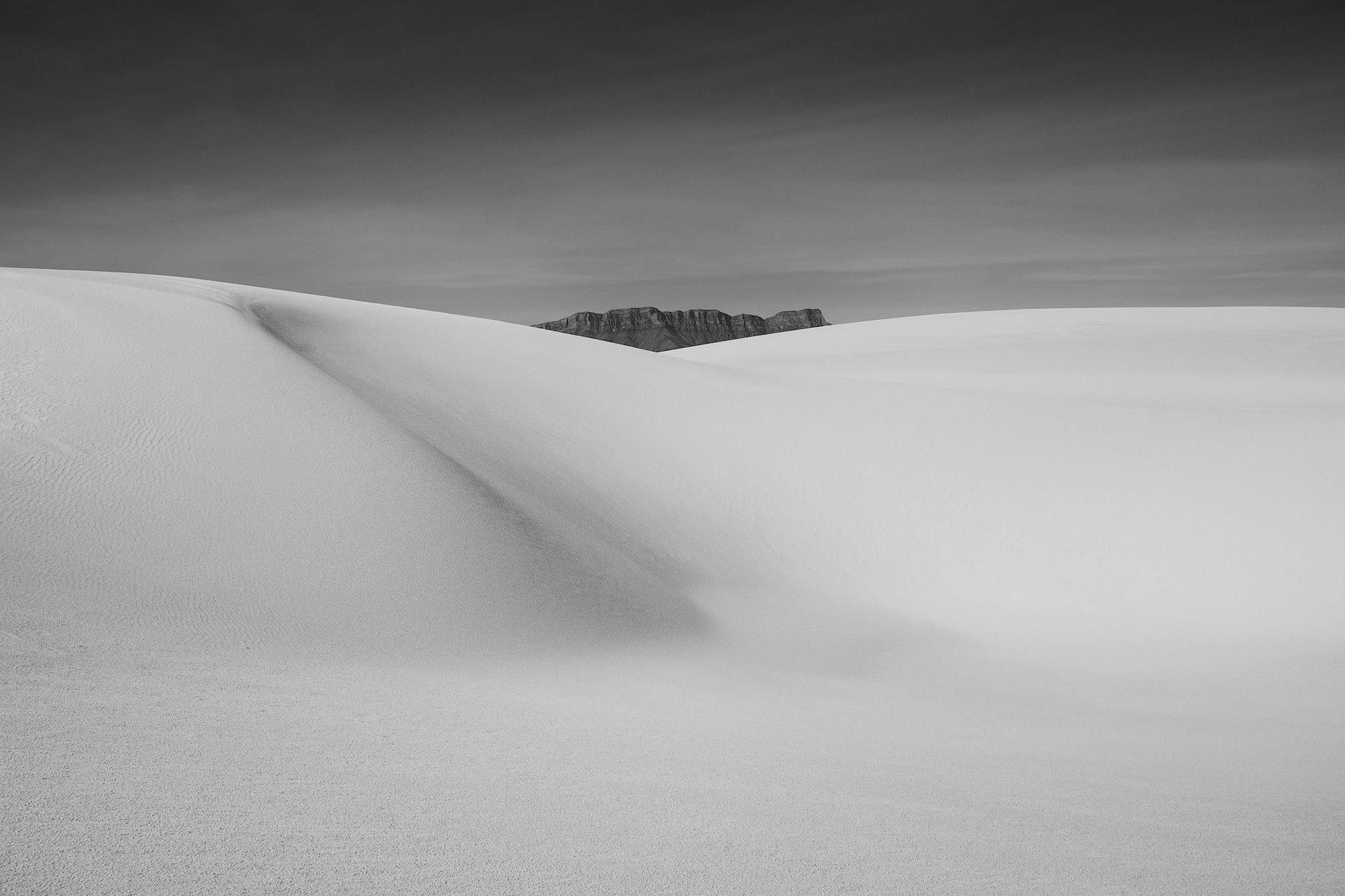
For all intents and purposes, this image was an accident. I simply intended to capture GPS coordinates to find my way back when the light was "better", not realizing I was shooting in great light perfectly suited for black and white.

Be more expressive and dramatic
When a color image is converted to black and white, the image is no longer rooted in reality. To me it's similar to watching a narrative film, where I know I'm watching a subjective interpretation of reality, not news or a documentary. I want the filmmaker to suspend reality and take me someplace fictionalized and fantastic.
Color photography, on the other hand, is more grounded in reality for that's how most of us see the world. We have rules and expectations for color, and there's greater tendency towards "correcting" colors for visual accuracy. This isn't a hard and fast rule of course, for there are plenty of examples of color images and films with unconventional, purposeful colors that enrich a mood or narrative, but black and white is immediate.
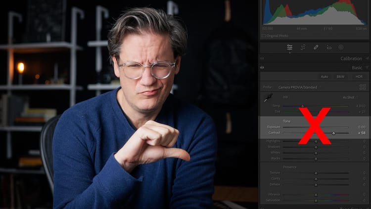
When working in black and white, I know I'm looking at a fictionalized world. I then more free, creatively, to push the image further away from reality. To own its identity, and make the image more emotive and less literal. This can be done by applying heavier dodging and burning than I would normally do with color. I can drop exposure and create dramatic, low key images, raise exposure for high key, or increase contrast to emphasize shapes and lines.
Put simply, black and white doesn't play by the same set of rules as color, which for me is a big part of its allure.
For example, the following image was captured just before the last light of day using a very slow shutter speed and low ISO to avoid noise and retain detail. The color image my EOS R5 captured looks nothing like what I saw and experienced while standing there, for the camera exposed for middle gray, which created an overly bright image. There's also a strong magenta color cast, and the colors are muted and not particularly uninteresting.
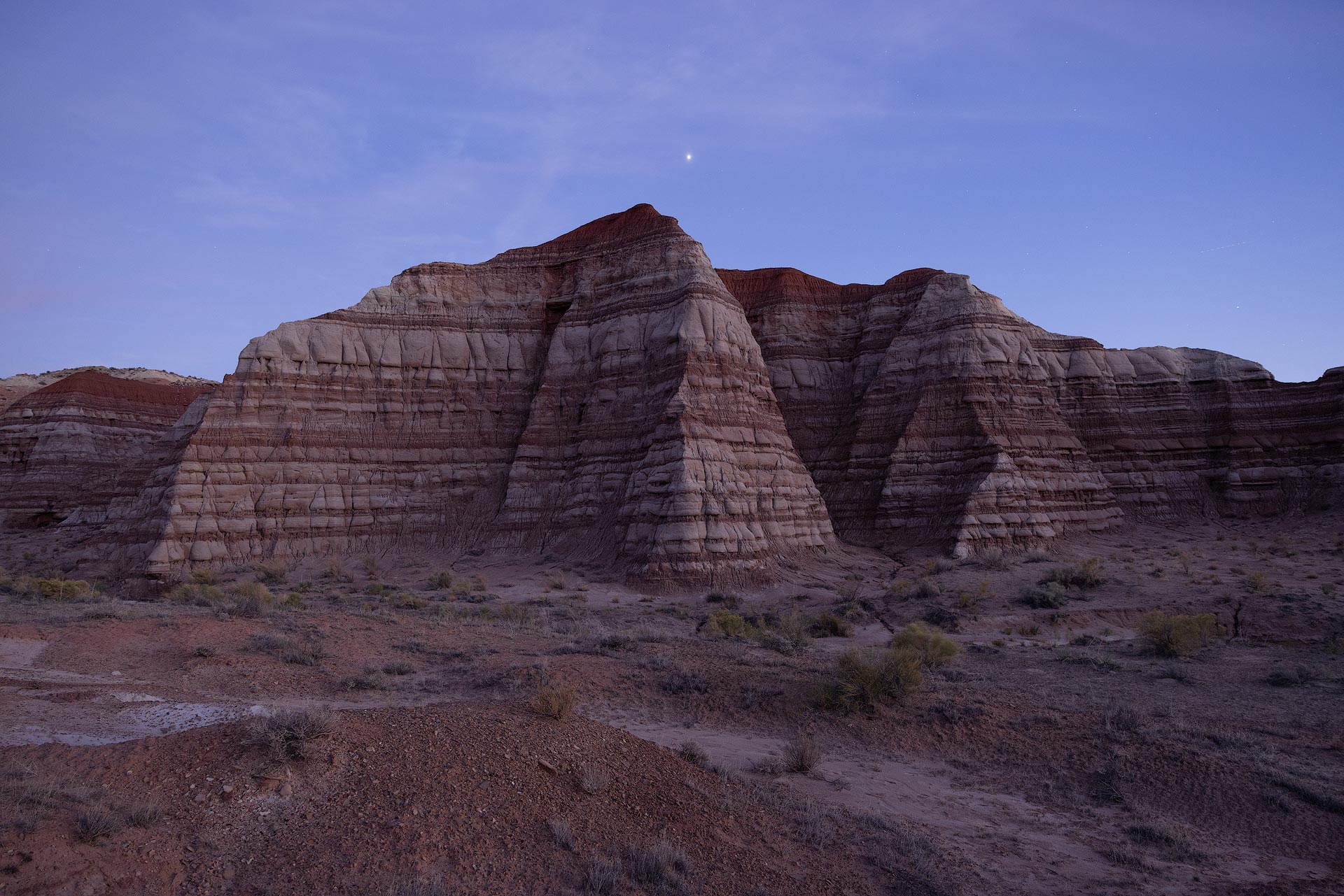
I knew when taking this image that I would likely convert it to black and white, and sure enough that's exactly what provided the tone and atmosphere I was looking for. I wanted the image to feel heavy and moody, like a dark blanket, but without losing detail and texture. With black and white, I felt I could take the image where I wanted to creatively; further than what (I believe) I could have achieved by editing the original, color image.
Colors are still important
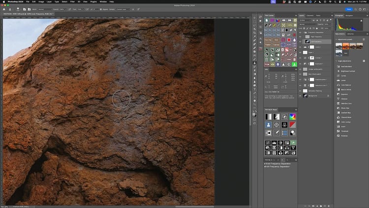
Converting an image to black and white removes color, but not completely. You can't see it, but a non-destructive photo editor does. This is why Adobe Lightroom changes its Hue, Saturation and Luminosity ("HSL") panel to "Black & White Mix" (pictured below) when switching image treatment from "Color" to "Black & White" at the top of the Develop panel.
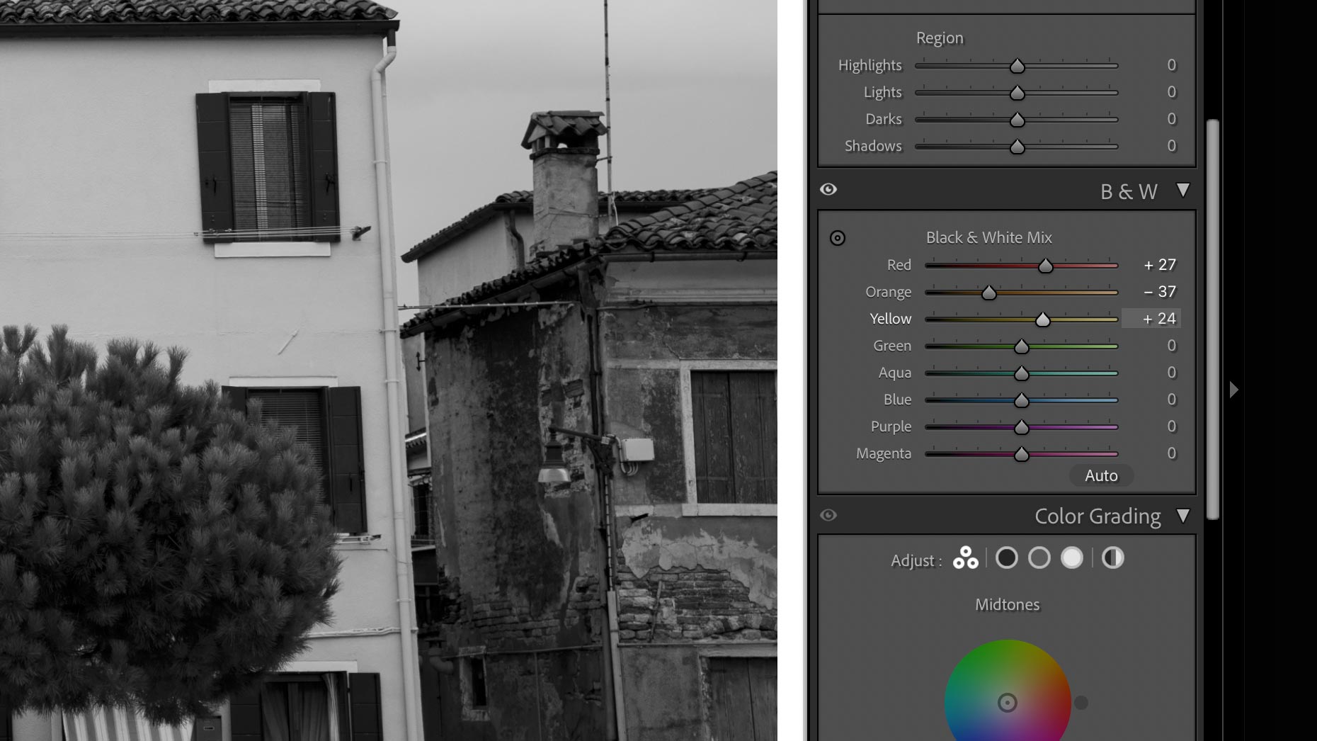
This mixer adjusts the sensitivity of each color, which raises and lowers their luminosity in the black and white image. So if you want brighter green trees, raise the Green slider. Darker sky, lower the Blue slider. This makes it possible to adjust the tonality and contrast of the image using specific, targeted colors instead of (or in addition to) standard tonal adjustment tools including Highlights, Whites, Shadows, Blacks, Tone Curve, and others.
Another way to darken color is to increase saturation. This can be done by aggressively modifying the White Balance and/or Tint sliders, as well as the Calibration panel at the bottom of the Develop column in Adobe Lightroom. This can be an effective way to increase depth, contrast and texture in specific areas.
Black and white cannot fix a weak image
I find it easy to get wrapped up in the romanticism of black and white, for some of my favorite landscape images from the true masters of the genre were created in black and white. For that reason, I sometimes catch myself using black and white not because it enhances the underlying, creative intent of an image, but because I think it will "fix" a weak image and make it appear more substantive than it actually is. An attempt at creating depth and validity where none exists.
To avoid this, I've learned to sit with black and white images for a while before deciding whether to keep their revised treatment. Sometimes this means making a print, placing it on a shelf, and living with it for a while. This dampens the initial excitement of seeing a color image in black and white, and helps me more accurately and honestly evaluate whether I've utilized black and white in a responsible, authentic manner.
Better editor for black and white
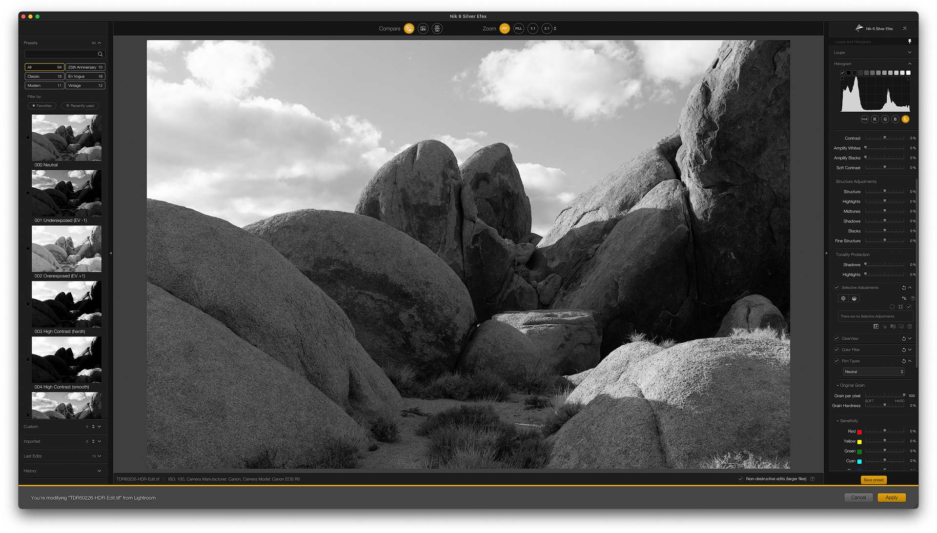
I would imagine most photographers convert color digital images to black and white using Adobe Lightroom, Camera Raw, Photoshop, Capture One, or one of many desktop photo editing software applications. And for the average person, all of the above will certainly do the job.
But for those who want to delve deeper into black and white, and use a tool purpose built for it, you should check out Nik Silver Efex from DxO. The app is a bit old and could use some additional design and user interface improvements, but offers more brightness, contrast, and micro-contrast tools than any other editor. I very much enjoy editing black and white images with it, and hope that it continues to improve in the future.
Bonus tip: use black and white as a compositional tool in the field
Most digital cameras today have a black and white/monochrome setting that removes color from the live preview seen on the rear LCD screen. This is one of my favorite "hacks" when composing a landscape image in the field, for it removes distractions (ahem, color) and draws more attention to composition. To the shapes, lines and relationship between elements. It illustrates which areas of the image are brightest and will draw the most attention. Just like applying a mask, remember that white will reveal and black will conceal.
For those want to push this even further, also check whether your camera supports cropping the live preview to a different aspect ratio. For example, I often crop my images to 4:5 or 4:3, so I can setup my live preview for both black and white and my favorite aspect ratios to visualize, in real time, how my image will appear later when processed and edited.